Business Problem
Sales managers need to understand which customer groups are more likely to purchase bikes.
Without visualization,
identifying trends across demographics,
income,
and purchasing behavior becomes time consuming.
Solution
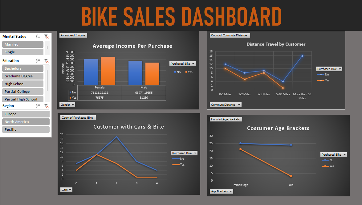
I designed an interactive Excel dashboard that transforms raw sales data into meaningful visual insights using Pivot Tables,
Pivot Charts,
Slicers,
and dynamic calculations.
Users can filter the dashboard by customer characteristics and quickly identify sales trends.
Key Features
- Interactive Pivot Table dashboard
- Customer age analysis
- Income comparison
- Commute distance analysis
- Occupation breakdown
- Education analysis
- Regional filtering
- Marital status comparison
- Interactive slicers
- Professional KPI visualization
Tools Used
Microsoft Excel
Pivot Tables
Pivot Charts
Slicers
Conditional Formatting
Dashboard Design
Business Value
The dashboard enables business users to identify profitable customer segments,
improve marketing decisions,
analyze purchasing behavior,
and support data driven sales strategies through interactive reporting.